There are a lot of stands for kindergarten. This is due to the fact that the information is addressed to different categories of people involved in the educational process. Colorful information boards are made for children, which are interesting for the child to look at and study. Parent information boards contain service information, announcements, rules and news. Useful information and reminders are posted at psychologist and speech therapist stands.
Another type of stands, in demand by kindergartens, has a discreet design - information about the educational organization, licensed activities, information for parents, materials for teachers and technical staff. There is also a group of mandatory stands, the presence of which is checked by control and supervisory authorities: labor protection, civil defense and emergency situations, safe routes.
Children's stands are mounted at the child's eye level. Information intended for adults is placed at a standard height in accessible places for viewing.
Why are stands needed in kindergarten?
When visiting a kindergarten, children and parents pay attention to bright, catchy and useful information stands, signs with menus and messages for parents, tablets for creative work and work schedules.
Thanks to competent information design, the administration has the opportunity to make the life of the children's team exciting, interesting and productive. The design and content of stands, signs and visuals for preschool institutions should be in harmony with the educational concept of the institution, interior design and style idea of the group. Bright drawings, favorite cartoon characters and non-standard shapes undoubtedly decorate the premises and make groups and auditoriums cozy for kids and parents.
Information stands are made from safe and neutral materials using non-toxic dyes. This paint adheres perfectly to the surface of wood or plastic and does not produce an unpleasant odor or harmful fumes.
MAGAZINE Preschooler.RF
Author: Savelyeva E.V. – educational psychologist, preschool educational institution No. 242 SB RAS Today, almost every institution has information stands or notice boards. These visual forms of informing people have recently become especially popular. Firstly, because it is an effective way to convey information to a large number of people at once. And secondly, they form a corporate space, support the corporate style of the institution, create a special atmosphere in the institution, and are also a reflection of the culture and competence of the people who work in it. (Slide 1) However, creating a good information stand so that it copes with the tasks assigned to it is an entire art. There are many little things in this case that may well negate all the efforts of its creators. Therefore, today at the seminar we want to talk to you about (Slide 2) What psychological characteristics of human perception must be taken into account when creating an information stand?What are the requirements for the design of an information stand in a preschool educational institution? What content can be filled with an information stand in a kindergarten group? Let's remember one of the classifications of forms of interaction between teachers and parents and make sure that visual and informational forms of work have a mandatory place in the work of a teacher. (Slide 3) Collective forms of work involve working with all or a large number of parents of a preschool educational institution. (These are joint events between the teacher and parents.) Individual forms are intended for differentiated work with parents of students. Visual and informational - play the role of indirect communication between the teacher and parents. They solve the problems of familiarizing parents with the conditions, content and methods of raising children in preschool educational institutions, allow them to more correctly evaluate the activities of teachers, and revise the methods and techniques of home education. Visual information forms can be divided into two subgroups: (Slide 4) One of them consists of information and informational forms. The objectives of this group are: • To familiarize parents with the activities of the preschool educational institution, • The features of its work, • With teachers involved in raising children.
In general, they are aimed at overcoming superficial opinions about the work of preschool educational institutions. Another group consists of information and educational forms. The main task of this group is to enrich parents’ knowledge about the characteristics of the development and upbringing of preschool children.
There are requirements for creating an information stand that are based on the psychological characteristics of human perception. Let's look at some features of the organization of perception. A game. Educational and developmental potential of the game. Studying the characteristics of human perception; training memory, attention, perception. Contents of the game. You need to select 4 people who differ in several ways (for example, age, teaching experience, marital status and position in the institution). They are asked to describe the appearance of one of their colleagues with their eyes closed. At the end of the game, you are asked to compare the description of the person and his real appearance. We continue our conversation about the features of the organization of perception. — Tell me, what do you see on the slide? (Slide 5) In fact, the slide shows a group of individual lines. But we see the outline of a human face. This is due to the fact that our brain is always trying to reduce a fragmentary image into a figure with a simple and complete outline, trying to put together the parts and add the missing ones. This explains the principle of filling in the gaps. Regarding the information stand, this can be used when filling out the content of the stand. Today you post one piece of information, tomorrow you add another on the same topic. When reading new information on a previously known topic, our brain automatically restores what is missing and fills in the gaps in the topic. — Tell me, what do you see on this slide? (Slide 6) Visually you perceive three groups of objects. This is because our brain combines close or adjacent elements into a single form. It is easier for us to perceive three groups of figures than nine figures that are not related to each other. This explains the principle of proximity. Regarding the information stand, this can be used like this. If you place part of the information on paper of the same color, the information will be combined into a single block. — Tell me, what do you see on this slide? (Slide 7) In this figure, the numbers appear in the form of columns rather than in the form of rows. This is explained by the fact that it is easier for our brain to combine similar elements. Grouping properties can be similarity in size, shape, or arrangement of parts. This explains the principle of similarity. Regarding the information stand, this can be used like this. Place several information materials united by one topic in one form or on the same background or in a single color scheme or using a single font, etc. Those. there must be some sign of similarity. Let's look at another feature of perception. — Tell me, what do you see on this slide? (Slide In front of you on the slide is a so-called ambiguous drawing. Some of you first saw a vase, and then two profiles. Others saw the opposite. Looking at the drawing, we perceive the background as either black or white. This is due to the fact that when we see an unfamiliar object we try to catch in it the similarity with objects familiar to us and attribute it to a certain group of objects. What a person perceives at the moment depends on what is brought into this process by past experience, as well as on what he wants at the moment . In this case, there is a rivalry between the figure and the background. Each of them in turn “goes" into the background and ceases to be perceived. When placing information on a stand, it is very important to take this feature of perception into account. It is important to understand what you want parents to see as the background and what as the figure. Let's try to analyze the information materials that you posted on the kindergarten website from the point of view of perception of the background and figure.In addition to the features that we have already talked about, there are others. For example, features of perception of the shape of objects. (Slide 9) When designing an information stand, it is necessary to remember that the form is perceived subconsciously by a person, even before the content of the text is perceived. The square and circle are associated with clarity and simplicity. Therefore, this form is most preferable for preschool institutions. A rectangle with a width half as long as its length seems to split into two squares. Therefore, the information located on such a stand will also be divided into two semantic parts. For example: “Do it with your children.” Stand shapes with closed curved lines, reminiscent in shape, for example, of a flower, will be perceived unofficially. It is better to place unofficial information in them, for example: “For reading at home”, “Congratulations”, “Musical and poetic page”. Several small stands arranged in “steps” create a feeling of dynamics and movement. At such stands it is good to post information about the development of something. For example: “Our achievements.” When designing an information stand, it is necessary to take into account such a physiological feature as color perception. Let's do a little research on human color perception. I invite 3 people (of different ages, different personalities). Instructions: “Look at the ad and tell me what sensations you experience when you perceive the information placed on the sheet ... colors” (Slide 10-16) Our research has shown that color has a certain emotional effect on a person. The psychological literature describes the emotional perception of each color. (Slide 17) Thus, color can tire, excite, affect performance, and change the visual perception of the volume and shape of depicted objects. Therefore, when decorating a stand artistically, it is important to use color correctly, taking into account its psychophysiological effect. When working with color, it is necessary to take into account that: The color scheme of the stand depends on the nature of its content and must be in harmony with the color scheme of the interior in which it is located. To create an expressive image, it is recommended to use a limited number of colors (no more than 3). A large number of colors creates excessive diversity and complicates the perception of the meaning of information. Use color as a means of highlighting what is most important. This is achieved by matching contrasting colors or shades. The so-called color wheel allows you to determine contrasting colors. If you take two colors located in a circle opposite each other (through the center), then they make up a pair of complementary contrasting colors. (Slide 18) Preference is given to a tonally contrasting design of the stand: light on dark, dark on light. When using contrasting colors, it is important that their number is not the same. There should be more of one color from a pair of contrasting ones. Intense colors are used in smaller quantities compared to calmer colors. Consider color and age preferences. So children prefer bright colors, adults prefer more restrained ones.
Thus, color has a very active influence on human perception. This feature must be taken into account when creating and designing a stand. I propose to talk about one more component of the information stand. This is the font. It must also be used taking into account the psychological characteristics of our perception. Fonts not only communicate information, but are also an active artistic element. When choosing a font, you must follow some rules: • Text inscriptions should be short, expressive, with a logical breakdown of phrases. • The font should be clear, clear, simple, and easy to read. The clearest fonts are those with straight lines and sharp angles. • Text in all capital letters is read 12% slower than lowercase text. • An important condition for the perception of inscriptions and numbers is the color of the sign and its contrasting relationship with the background color. The signs are most noticeable when they contrast with the background not only in color, but also in lightness. For example. 1. Black letters on a light yellow background, dark red on a light gray or white background and the inverse ratio give a very good effect. 2. Blue color in combination with white or gray is used for signs and inscriptions of a purely informational nature. • Perceiving information located at the edges of the sheet requires much more effort than reading information located closer to the center. Therefore, the edges around the entire perimeter should be a clean, untouched area. • In a font composition, it is advisable to use no more than two fonts at once, and the fonts should be close in style. Let's look at some options for the relationship between color, shape and font, and try to find errors when using them. (Slide 19) Conclusion. It is necessary to take into account the psychological characteristics of perception when designing an information stand. Remember that excessive saturation of information interferes with the perception of meaning (Slide 20).
| Next > |
Recommendations for the design of stands in kindergartens
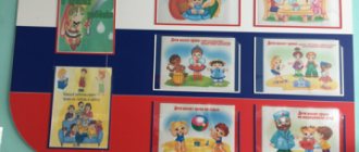
In the corridors and groups of preschool institutions, it is necessary to place information corners that will not only appeal to children, but will also help convey the necessary information to parents, children and teachers. News and messages can be presented in the form of signs, diagrams, pictures, information or photo corners. Manufacturers of advertising products offer to design an information corner in the following options:
- Business cards of the group or institution are placed in the corridors, at the entrance to the kindergarten or at the management office. Specify the name and symbols of the institution;
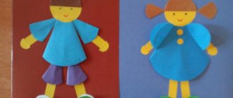
- Exhibitions of drawings are presented in the form of a huge board on which children's creative works are recorded after classes;
- Methodological recommendations for parents from psychologists, speech therapists, medical workers or administration of the institution;
- Corners with announcements, where information is replaceable and can be regularly updated due to the presence of a transparent pocket;
- The symbolism of the group informs students about the concept and idea of the educational institution.
How to choose material for making a stand?
The most popular material for making information boards is cork. This material has a lot of positive characteristics and is suitable for use in institutions of any type. It is cork that is chosen for stands for kindergartens, as it is a safe and hypoallergenic material. Let us also note other advantages of cork boards:
- Moisture resistance;
- Durability, wear resistance, resistance to mechanical damage;
- Excellent impact force retention;
- Resistant to chemical detergents;
- Fire resistance;
- Resistance to the growth of fungus and mold;
- Quite a long service life.
To decorate the back side of the stand, you can use a thin sheet of plywood or fiberboard.
What can be placed on stands in kindergarten?
There are many options for information content for corners, stands and signs in preschool institutions. To decide on the content of visual materials, it is worth considering the most popular options:
- Methodological recommendations from medical professionals on the need to develop correct posture, with an algorithm for performing speech therapy exercises, an optimal daily routine, vaccination schedules or the prevention of colds.
- Safety rules on the road during a fire or emergency.
- Organizational issues in the group: changes in the schedule, dates for children's parties, trips and excursions, time for organizing classes, lists of things.
- Menu list with details of dishes, meal times, calorie content and portion sizes.
- Legislative stands with the rights and responsibilities of children. The standards will help children understand their own capabilities and rights to legal assistance.
- Educational information for kids with names of seasons, months, alphabet, multiplication tables, colors, animals, countries and continents.
- A corner with the achievements of the group’s students: photographs, award diplomas and certificates, and creative results are posted here.
Regardless of the content of information or entertainment stands, care must be taken to maintain a clear style. It is important to design the corner in accordance with certain requirements, to create a design that will allow you to better assimilate and quickly remember the required amount of information.
Do-it-yourself stand: features and manufacturing principles
So, the first thing you need to start with is the basis of the design. Once the size of the stand is determined, you need to select a cork board and plywood of the appropriate size and glue them together using glue or liquid nails. Next, the workpiece must be painted, covered with fabric or film, and you can begin to decorate it.
You need to start designing the design with the pockets in which sheets of information will be placed. For this purpose, you can use plexiglass of a suitable size or durable stationery files. The number of pockets can be absolutely any.
Next, you need to determine the theme of the design. This could be a lesson schedule, a corner of a healthy lifestyle, congratulations on the holiday, and so on. The name of the stand is an important part of its design. The title should be bright, large and eye-catching. Remember that an information stand is a business card of an organization, so special attention should be paid to its design. Letters for the title can be cut out from bright plastic or from unnecessary magazines.
Remember about the frame of the stand. With a frame, the design will look more aesthetically pleasing and laconic.
Sheets with information and other important information can be attached to the stand using buttons or safety pins, but if we are talking about a child care facility, then it is worth finding an alternative method.
Advantages of making your own stand
- The ability to create a unique, original, inimitable design, convenient location, shape and size.
- By making the structure yourself, you can choose materials that perfectly match the interior of the room.
- You will have the opportunity to place on the stand only the information that you need, as well as choose the optimal location of pockets on the board.
- By making your own information board, you will have the opportunity to choose the color scheme that best suits the overall style of the room.
- You don't have to adapt to a design made from a template, as you can arrange the pockets and information fields as you wish.
- Handmade work is a great way to emphasize individuality and add zest to the image of the room.
Making the structure will not take much time and will not take much effort. In just 30 minutes you can make a simple, small-sized design. With stands of larger size and complexity you will have to tinker a little, but rest assured that the result will exceed all your expectations.
The stands are actively used by people, both at home and in educational, medical, transport and other institutions.
Important information, plans for the future, memorable photographs, an organizer, a list of employees, a class schedule, and this is not an exhaustive list of information that can be located on the stand.
Types of information stands
Floor-standing
Floor information stands are an easy-to-move design. A plastic, magnetic or cork board is used as a base. The table stand is supported by chrome legs or wheels.
Floor stands can most often be found at exhibitions, business conferences, and shopping centers.
Wall mounted
Wall information stands are a shield made of plexiglass, metal, PVC, cork or magnet. Wall stands are attached to the wall using hangers that are attached to an aluminum profile (frame).
Such stands are more popular than floor stands, as they contain important and urgent, but permanent information that can be easily changed in plastic pockets.
You can find wall-mounted information stands in stores, shopping centers, kindergartens, housing and communal services or in a hospital . Wall-mounted ones are often used as information stands for offices.